
It is a common misconception that Vaadin is a desktop framework with little to no mobile support. The assumption is that when opening a Vaadin application on a phone, it just gets a cramped version of it.
It is not true, and it has not been true since version 10. What the framework never shipped was the frame around your content — the navigation, header, and footer. Two new Directory add-ons, AppNavLayout 25.1.2 and AppHeadroom 25.1.1, fill that in.
TLDR
- Vaadin's components have had touch and small-screen support since version 10: responsive layouts, mobile-native input fields, and an adaptive AppLayout.
- What was missing was the chrome — the navigation, header, and footer around your content.
- AppNavLayout builds your navigation from the
@Routeand@Menumetadata you already have, and renders it as a desktop drawer, a tablet side rail, or a phone bottom touch bar, re-picking on rotation with no page reload. - AppHeadroom hides the header and footer on scroll down and restores them on scroll up, in one line, on any AppLayout.
- Both require Vaadin 25.1 or later and Java 21, are Apache 2 licensed, and are in the Vaadin Directory. Runnable example: mobile-showcase.
Who this is for: Java developers deciding whether Vaadin can serve phones and tablets, and Vaadin developers who do not want to maintain a second navigation implementation for mobile.
What Vaadin already does on mobile, with no add-on
Since version 10, the framework's components have included built-in touch and small-screen support: input fields you can interact with in mobile-native ways, responsive layouts, and the adaptive AppLayout. Vaadin documents its components as responsive and optimized for both desktop and small touch screens, and the specifics back it up.
Components
- Select, DatePicker, and ContextMenu move their overlays to the bottom of a small viewport, where a dropdown anchored to its field would be clipped or unreachable.
- ContextMenu opens on a long press instead of a right-click.
- Upload turns off drag and drop on touch devices, because mobile browsers do not support it.
- EmailField, NumberField, and IntegerField carry input types that summon the matching on-screen keyboard.
- AppLayout collapses its drawer to a hamburger menu on a small viewport, and moves anything placed in its touch-optimized navbar slot to the bottom of the page on a touch device.
- MenuBar overflows when its items stop fitting, and Tabs grows scroll buttons for the same reason.
- FormLayout is responsive out of the box: in responsive-steps mode the default is one column below a layout width of 40em, and two columns above it. (In Vaadin 25.1 the default mode depends on the
defaultAutoResponsiveFormLayoutfeature flag; with the flag enabled, FormLayout picks its column count from the available width instead.) - MasterDetailLayout, GA in 25.2, shows master and detail side by side and pushes the detail into an overlay when the space runs out.
The platform underneath
@PWAhas generated manifests, service workers, and icon sets since Vaadin 12.- ExtendedClientDetails reports touch capability and physical screen dimensions to the server.
- Vaadin 25 added a ScreenOrientation API.
- AppLayout exposes the safe-area inset variables that keep content clear of a notch or a home indicator.
@Menu, added in Flow 24.4, together with MenuConfiguration in 24.5, made an application's own route structure readable by other code, which is what lets an add-on build a menu out of it.
Most of this predates the current major version by years.
What is still missing: the chrome around your content
So although the framework supplied the building blocks for your mobile-friendly application, it was still up to you to assemble them into the frame around your content: the navigation menus, header, and footer that make up an application's chrome. It was up to you to put all those pieces together if you wanted the app to look and behave like a mobile app on a mobile device. For that matter, it was up to you to put all the pieces together if you wanted the app to look and behave like a desktop app on a desktop. Who wants to do that twice (or three times if you want separate phone and tablet look and feel)?
Write once, run anywhere
Two new Directory add-ons help assemble those pieces for you. AppNavLayout automatically detects and builds your navigation menus from your routes and adaptively renders them in a device-appropriate chrome layout for the device type — desktop, tablet, and phone. AppHeadroom hides your application's header and footer chrome as the user scrolls down and restores them on the way back up, to provide maximum scrolling space on cramped devices. Both add-ons are fully supported on all three device types. Both address the chrome; the responsiveness of your view content stays yours, built with Vaadin's layouts and components.
What AppNavLayout does
AppNavLayout builds your application's navigation for you, out of the routes you already have. By default, every view annotated for the menu shows up in it, titled and iconed as that view declares, ordered as you ask, and views whose routes share a leading path segment are gathered into a named group without either view having to say so. Add a view and it appears. Rename one and the menu follows. There is no second menu to write and none to keep in sync.
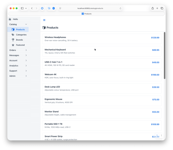
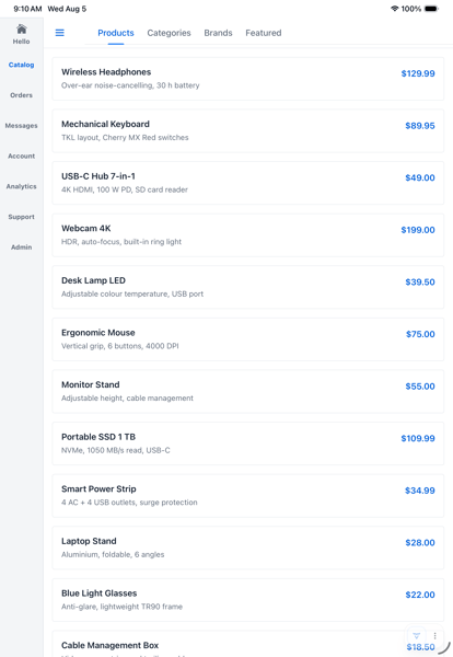
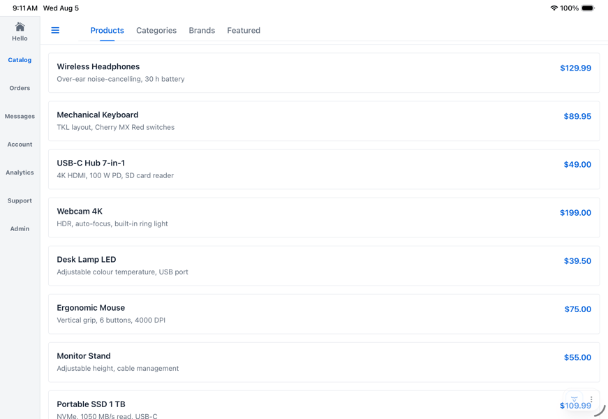
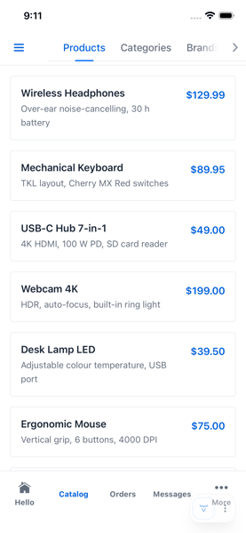
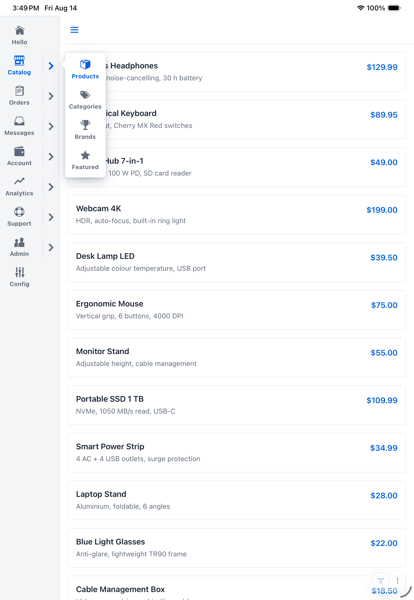
It then draws that navigation in whatever form suits the device: a drawer on desktop, a side rail on tablets, a bottom touch bar on phones. Rotate a tablet, resize a window, or drop an app into split screen, and it re-picks the chrome in place, with no page reload. That choice comes from touch capability and physical screen size rather than viewport width, so a desktop window dragged narrow keeps its drawer instead of sprouting a touch bar.
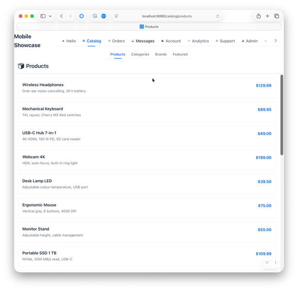
Desktop: a drawer.
Tablet, portrait: a side rail.
Tablet, landscape: the same rail.
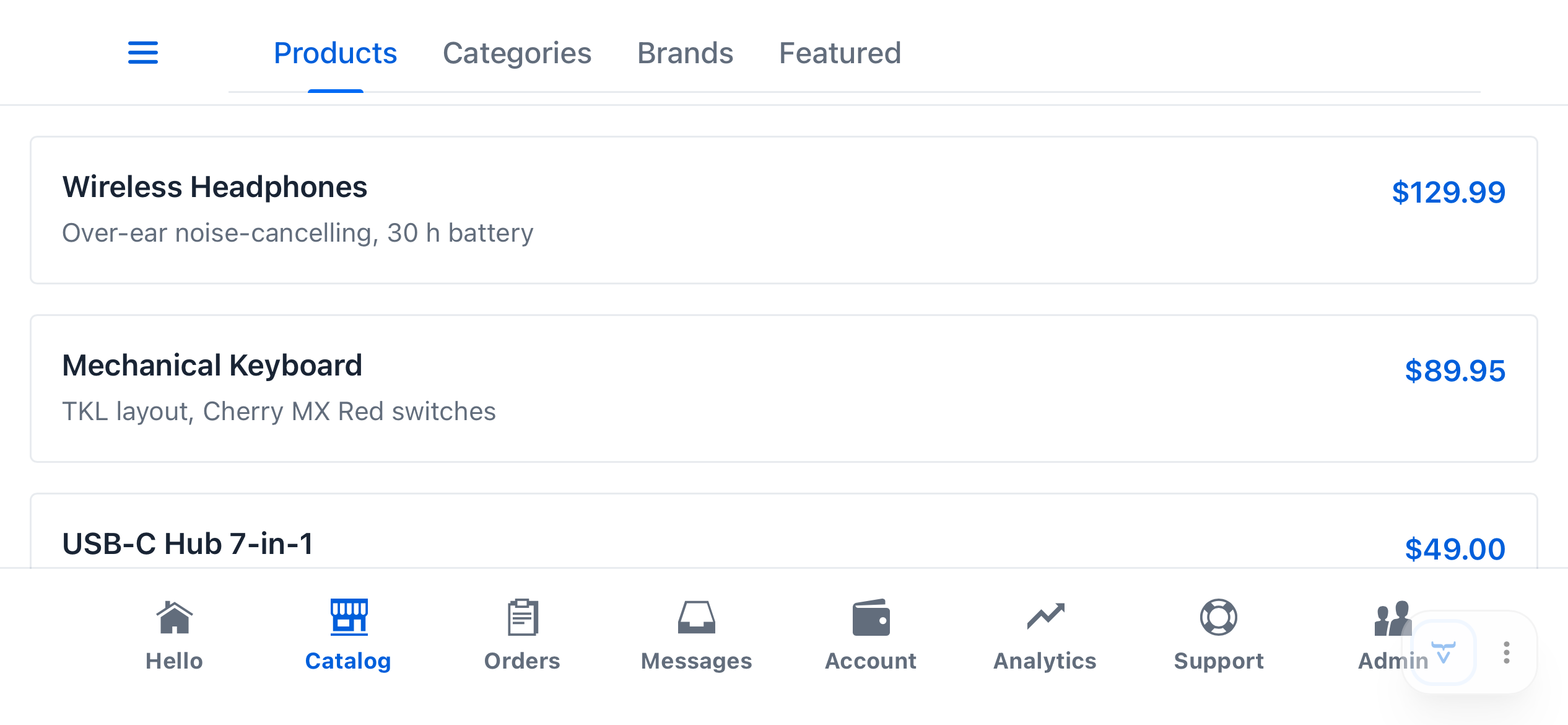
Phone, portrait: a bottom touch bar, with the extra sections behind More.
Phone, landscape: the same bar, wide enough that nothing overflows.
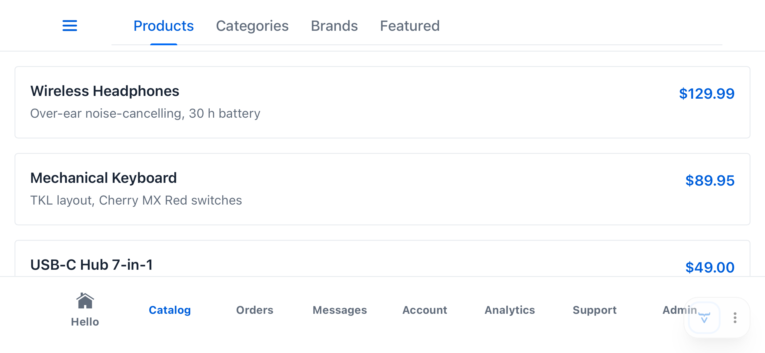
The awkward cases are handled too. An application with more top-level sections than fit across a phone collapses the extras into a "More" popover rather than truncating them. A route nested below a top-level item gets a drill-down bar with a back button that climbs one level at a time, however deep the hierarchy goes. Active items pick up whichever theme you have loaded instead of a hardcoded accent, and the space available for icons accounts for the device's notches, rounded corners, and home indicators.
What you can change about AppNavLayout
Every one of those defaults is a starting point rather than a rule.
Titles, icons, and grouping can come from wherever your application defines them: your own annotations, an enum, a map, a permission model. Groups can be named and iconed explicitly instead of inheriting a path segment, declared once per package rather than repeated on each view. The grouping algorithm itself can be replaced outright if route paths are the wrong hierarchy for your application.
Group icons and reworked labels, applied once and carried into every chrome.
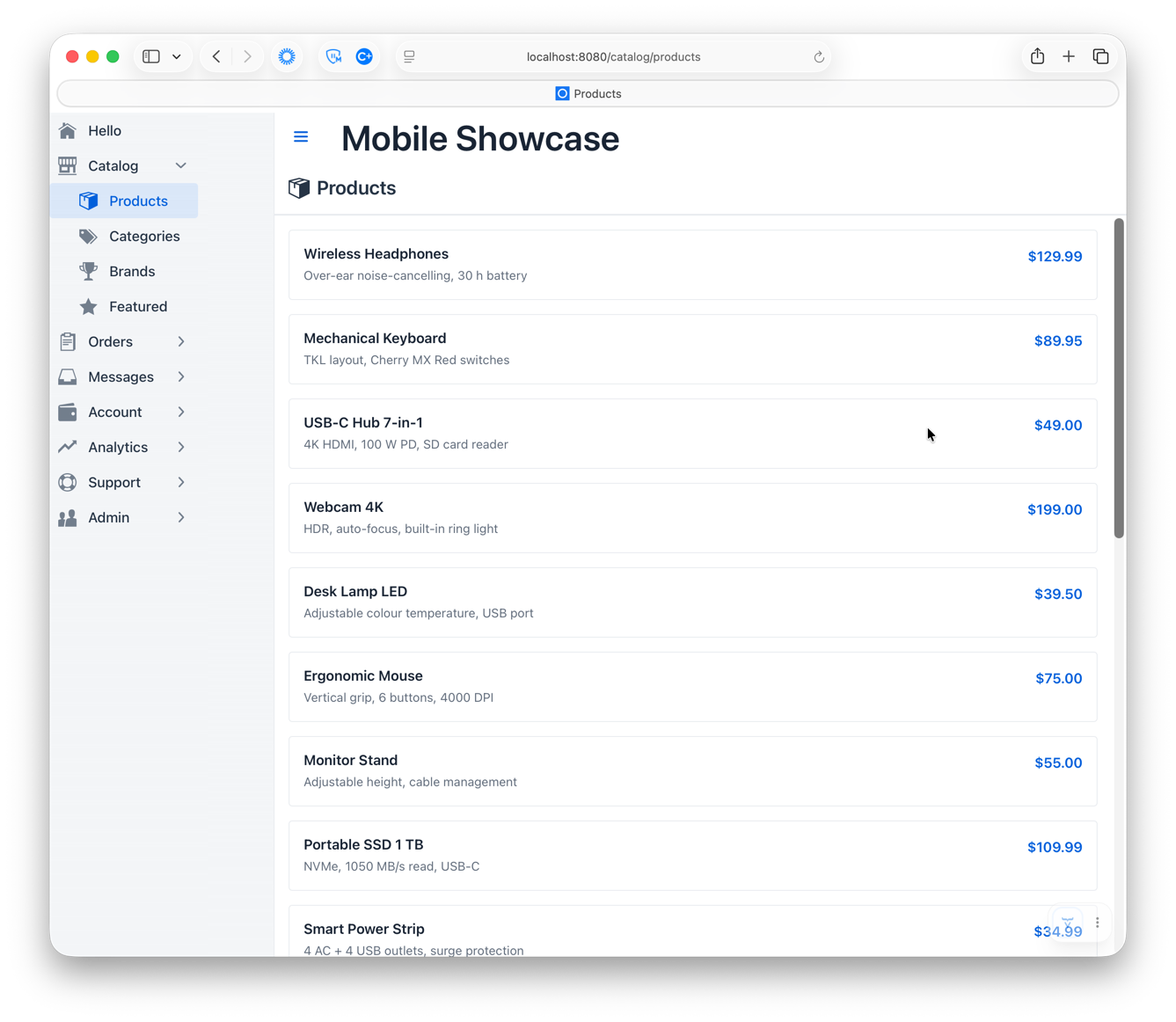
Desktop: a drawer.
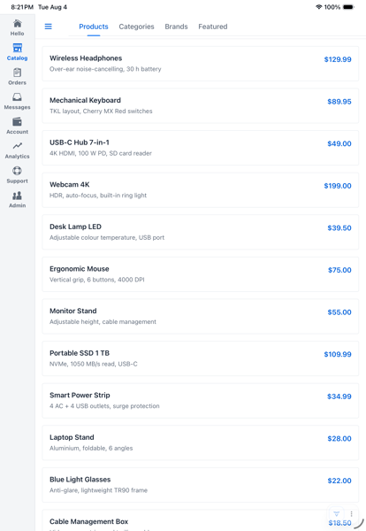
Tablet, portrait: a side rail.
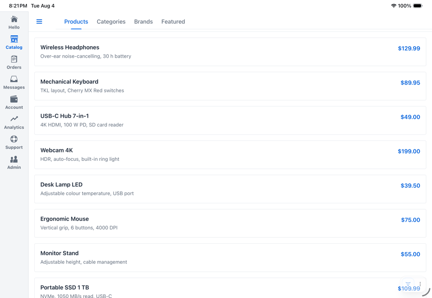
Tablet, landscape: the same rail.
Phone, portrait: a bottom touch bar, with the extra sections behind More.
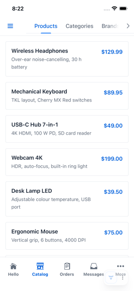
Phone, landscape: the same bar, wide enough that nothing overflows.
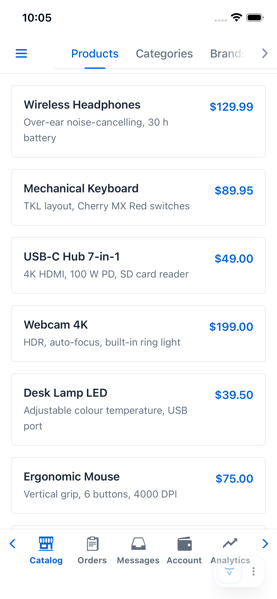
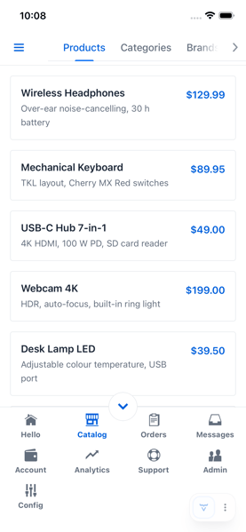
The chrome is equally open. Four alternate renderers ship ready to use: a horizontally scrollable touch bar, an expanding one, a rail whose groups open in flyouts, and a tab strip that spans the header instead of a drawer. Any of them can be assigned to any device and orientation — in any combination. A built-in renderer can be subclassed to change one behavior and leave the rest, and when none of them fit, the renderer interface enables you to implement a fully custom one. The four alternates are as much worked examples for your reference as they are options.
A tab strip across the header, instead of a drawer.
A rail whose groups open in flyouts, nested as deep as the routes go.
A touch bar that scrolls sideways, instead of collapsing into More.
A touch bar that expands upward to reveal the rest.
What AppHeadroom does
AppHeadroom hides your application's header and footer as the user scrolls down and brings them back on the way up. It works on any AppLayout or subclass of one, and applying it to a layout takes a single line.
That matters most on a phone, where those bars otherwise never go away and are taking their space from the one thing the user came for. Leaving them out would give the space back, but it would also leave the user with no navigation.
Condensed context cues
Hiding the chrome entirely costs the user their sense of place and their quickest way back. A condensed cue returns both while still leaving the content nearly the whole screen.
In place of a hidden bar, AppHeadroom can optionally cross-fade in a small component of your own as the real bar slides away. It comes in two flavors: a centered floating cue over the content and a ribbon that spans the full width with its background reaching into the safe area while its cue content stays clear of the notch or home indicator. Both are positioned, spaced, and timed for you; what the cue actually looks like is entirely yours, and the rounded pills below are the showcase application's own styling rather than a shape the add-on imposes.
Tapping any cue brings both bars back. Scrolling up still does the same, so the cue adds an alternative way back rather than replacing the main one. A cue is an ordinary component, so it can hold whatever is worth keeping on screen while the chrome is away, and it can change as the user moves through the application. In the recordings above, the top one names the current view and the bottom one names the section it belongs to. It could as easily be a breadcrumb trail, the name of the record being edited, a count of selected rows, an unsaved-changes indicator, or a filter count.
What you can change about AppHeadroom
By default the effect applies to every device type and orientation, and can be narrowed to just the ones that should have it, re-evaluated automatically whenever a device is rotated. How far the user must scroll before the chrome retreats, how far back before it returns, and how long the transition takes are all adjustable. A bar that should never hide can be told so, and a bar that has been reshaped into a vertical rail is left alone without being told.
Key features
AppNavLayout
Picking the right chrome
- Bottom touch bar on phones, side rail on tablets, SideNav drawer on desktop, chosen from touch capability and screen size.
- Rotation, resizing, and split-screen changes re-pick the chrome in place, with no page reload.
- Five device and orientation scenarios, each configurable independently.
- An adjustable threshold separating tablet from phone.
- Views can contribute an action component to the header, or a title to the desktop header.
Building the menu
- The whole tree comes from the
@Routeand@Menumetadata your views already declare. - Sibling routes sharing a leading path segment group under an auto-labeled section.
- Icons, titles, and grouping can come from your own annotations instead.
- The grouping algorithm itself can be replaced.
Handling small screens
- Sections that do not fit collapse into a "More" popover.
- Nested routes get a drill-down bar with a back button, to any depth.
- Icon capacity accounts for notches, rounded corners, and home indicators.
- Active items take their accent from the loaded theme, Lumo, Aura, or your own.
Changing the presentation
- Four alternate renderers ship ready to use.
- Subclass a built-in to change a single behavior.
- Implement the renderer interface for something entirely your own.
- Direct access to the underlying AppLayout navbar when nothing else fits.
AppHeadroom
The effect
- Hides the header and footer on scroll down, restores them on scroll up.
- Works on any AppLayout or subclass, attaching as a peer element.
Condensed context cues
- A floating or ribbon component in place of a hidden bar, cross-faded into position.
- Safe-area clearance handled for both shapes.
- Tapping any cue brings both bars back.
Controlling it
- Restrict the effect by device type and orientation, re-evaluated on rotation.
- Adjustable offset, tolerances, and transition duration.
- Collapsed state readable on the server, with a listener instead of polling.
Why use these add-ons?
They handle the parts that take longest to get right: more sections than fit across a phone, getting back from a view three levels down, a device rotating mid-task, and the safe area on hardware you do not have.
A menu built from your routes cannot drift from them. There is no second definition to keep current, and no way for a view to be reachable on a desktop and missing on a phone.
And every default can be replaced, one at a time, so using these add-ons does not mean taking every opinion in them.
Try them out!
Both add-ons require Vaadin 25.1 or later and Java 21, and both are Apache 2 licensed.
<dependency>
    <groupId>org.vaadin.addons.joelpop</groupId>
    <artifactId>flow-app-nav-layout</artifactId>
    <version>25.1.2</version>
</dependency>

<dependency>
    <groupId>org.vaadin.addons.joelpop</groupId>
    <artifactId>flow-app-headroom</artifactId>
    <version>25.1.1</version>
</dependency>
Both are in the Vaadin Directory, as App Nav Layout for Vaadin Flow and App Headroom for Vaadin Flow. Each repository carries the full API reference: vaadin-flow-app-nav-layout and vaadin-flow-app-headroom.
The fastest way to see all of it is the mobile-showcase application. It uses both add-ons and includes a configuration view for switching nav renderers, condensed cue shapes, and the headroom effect at runtime.
git clone https://github.com/joelpop/mobile-showcase
cd mobile-showcase
mvn spring-boot:run
Open it on a phone, rotate it, then open the same URL on a desktop.
Feedback is welcome. Leave a comment below or start a thread on the Vaadin Forum.
See both add-ons running
The mobile-showcase application runs on your own phone, tablet, and desktop, with a configuration view for switching renderers and cue shapes at runtime.
Open the showcase